Metrophobic Typeface
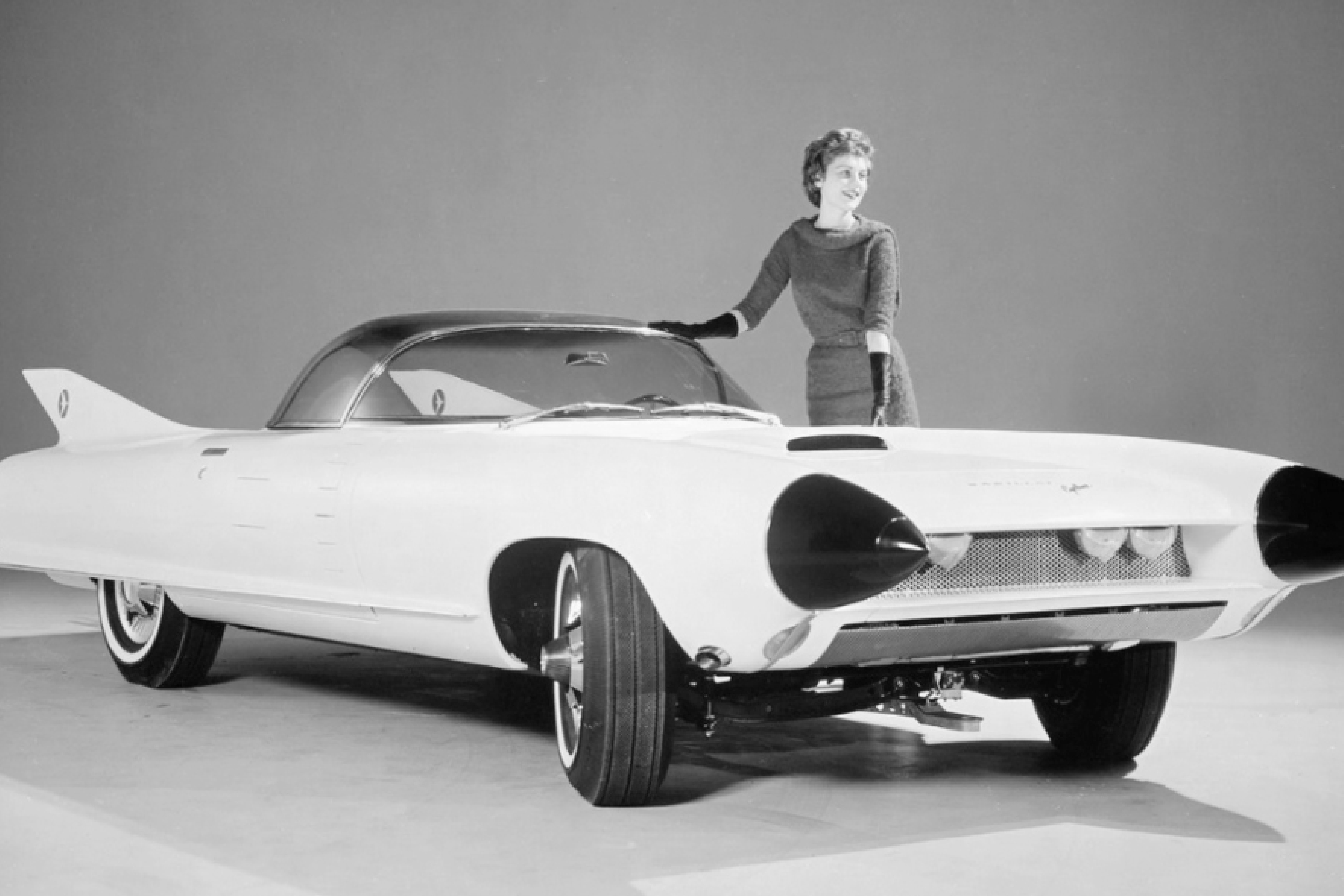
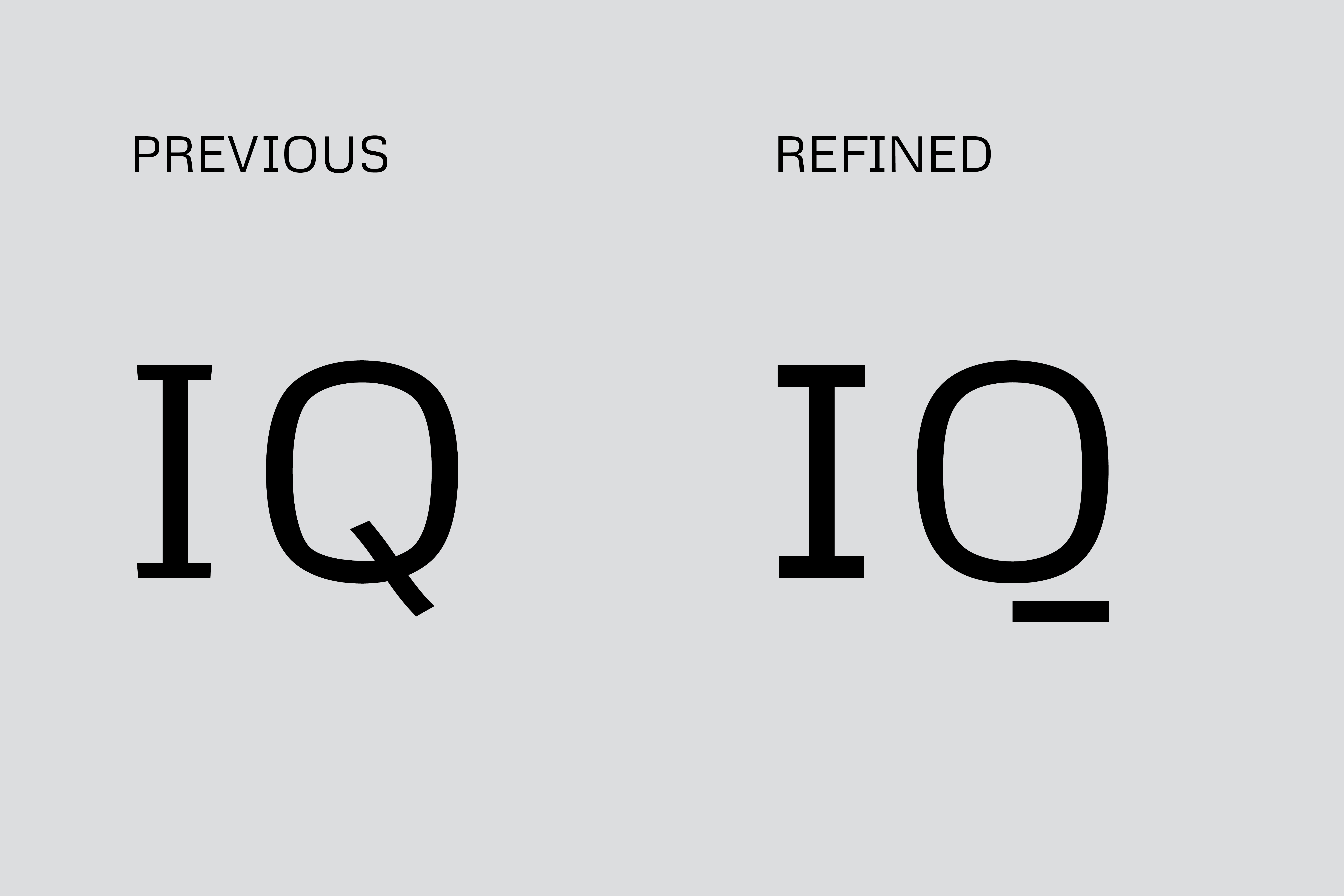
Metrophobic was originally designed by Vernon Adams. I revised and refined the original design, pulling inspiration from the design principles of the late 60s–80s.
Metrophobic was completed for Google Fonts in 2017 under the direction of Aoife Mooney and Dave Crossland. The typeface kerned by Anna Richards.
Metrophobic is available for free on fonts.google.com.


Distinctive characteristics make the typeface not too cold or mechanical. These characteristics help separate Metrophobic from its inspirations like Microgramma (1952) or Eurostile (1962).
The shape's language was refined for consistency across the typeface, which improved legibility and functionality.
Inspiration from the mid-century was more subtle in some letters, while others more evidently eluded to the ideology from the time period.


bumbalodesign@gmail.com
Sam Bumbalo ©
Sam Bumbalo ©
