
AdsWizz Audio Days Visual Identity
Aermetric Visual Identity
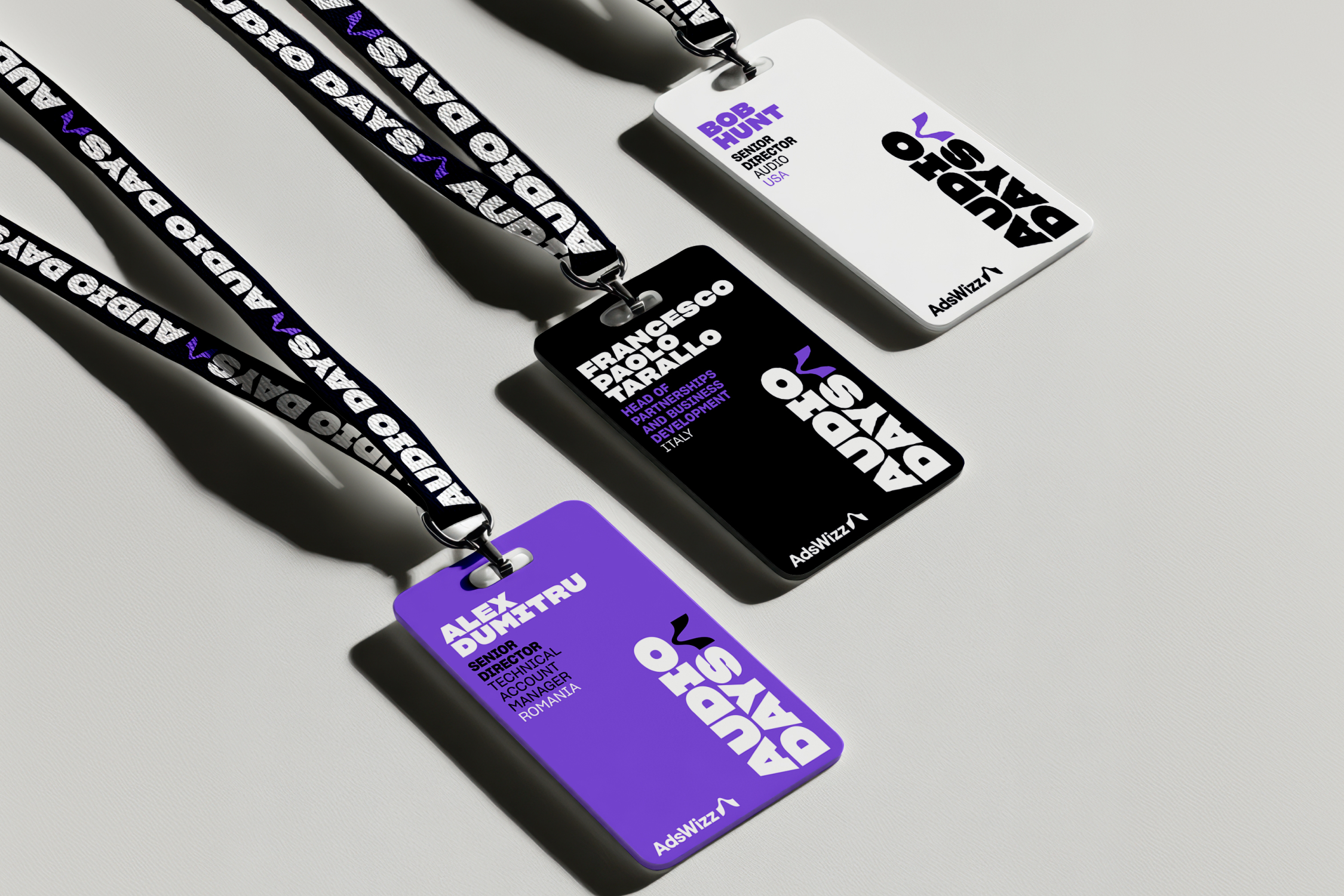
Audio Days is a multi-city technology conference on trends and advertising for digital audio. The visual identity for the conference springs off the main brand of the presenting company, AdsWizz featuring the AdsWizz logo, typeface, and colors.
The conference identity differentiates from the main brand itself with bolder typography, a modular layout system, and custom illustrations.
This was created at SiriusXM Media under the creative direction of Gina Murray and Joanne Easton with animation by Gabriel Reyes.
Audio Days is a multi-city technology conference on trends and advertising for digital audio. The visual identity for the conference springs off the main brand of the presenting company, AdsWizz featuring the AdsWizz logo, typeface, and colors.
The conference identity differentiates from the main brand itself with bolder typography, a modular layout system, and custom illustrations.
This was created at SiriusXM Media under the creative direction of Gina Murray and Joanne Easton with animation by Gabriel Reyes.
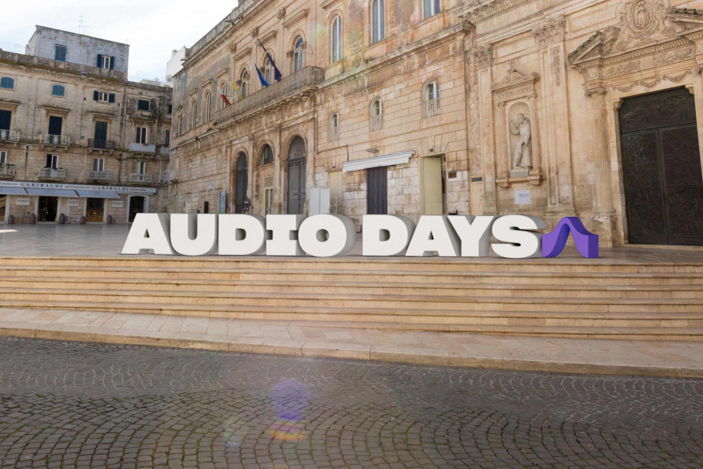
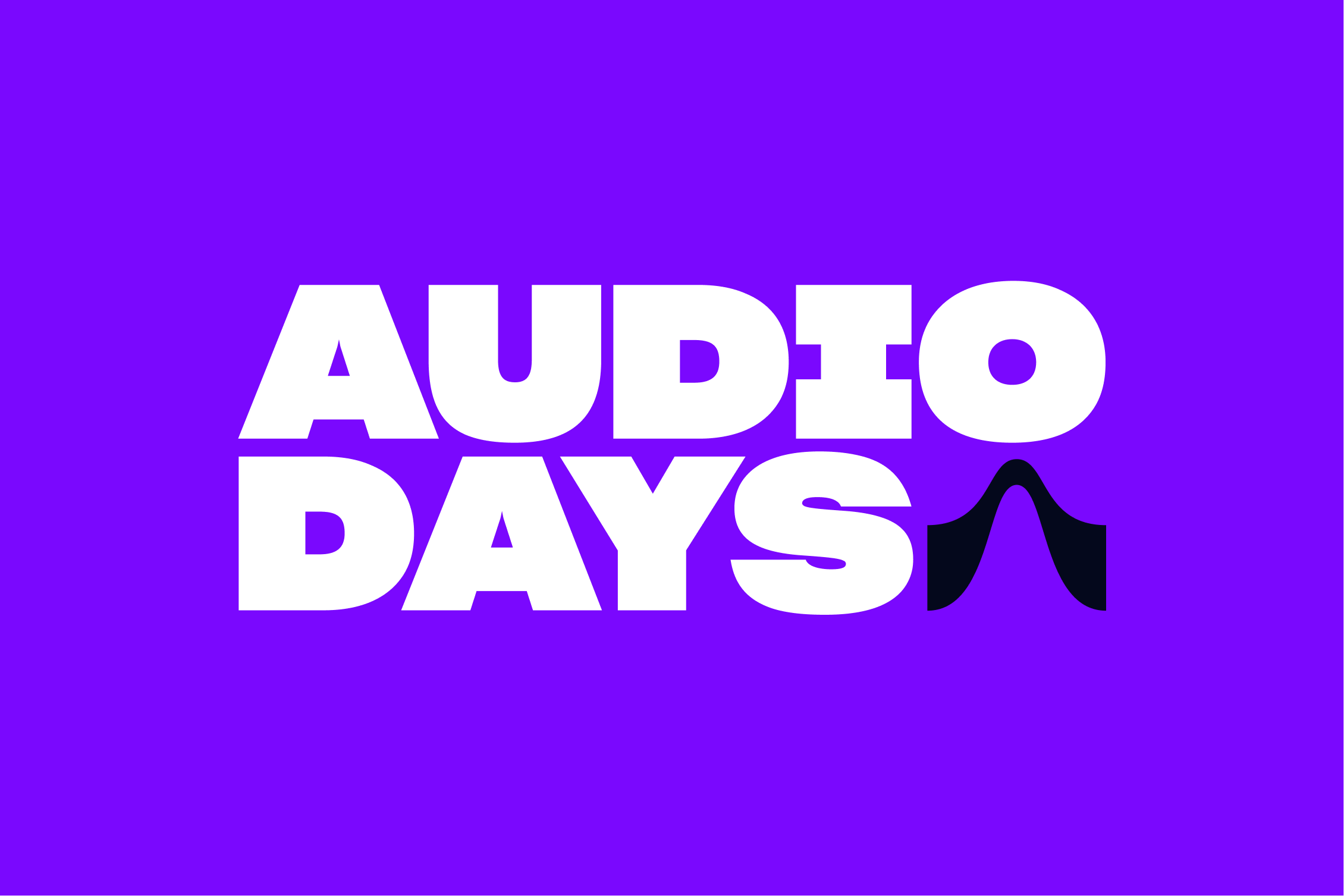
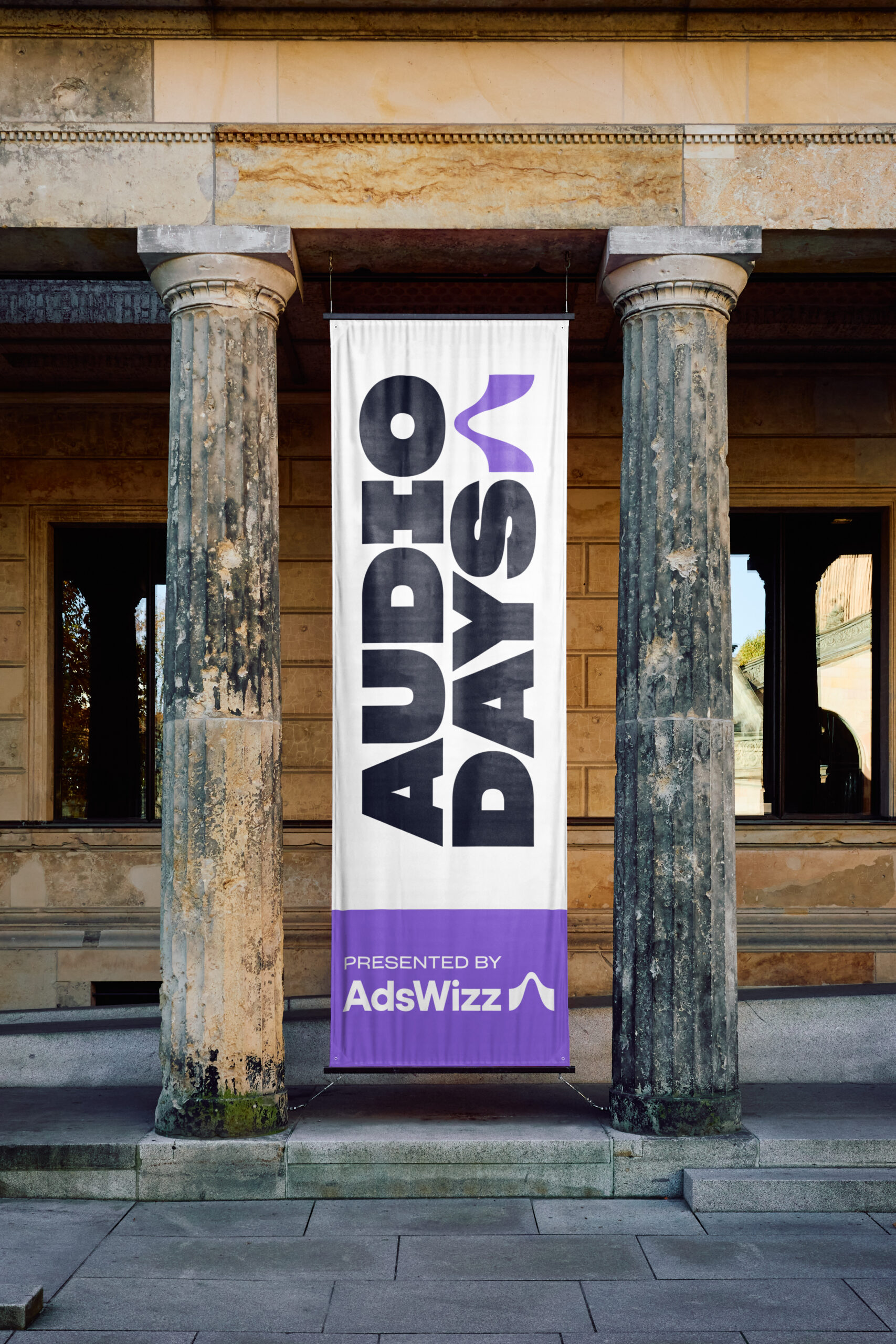
The conference logo features the symbol from the AdsWizz logo (right) and the supporting AdsWizz brand typeface, Sharp Grotesk.
The logo's typography is bold and modular to stand out to the main AdsWizz brand and to contrast the traditional look of the European cities the conferences travel to.
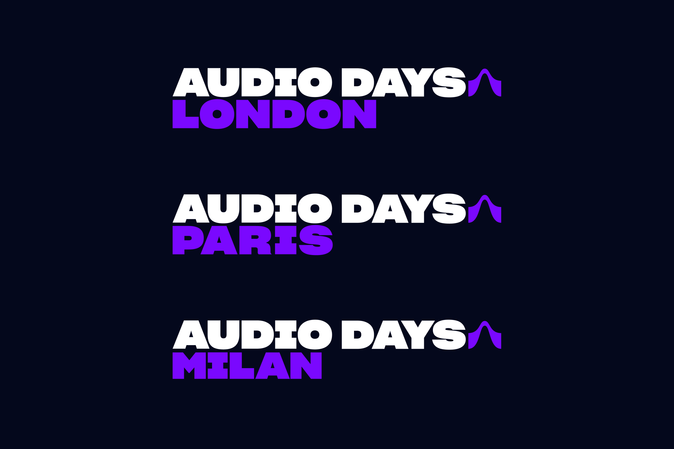
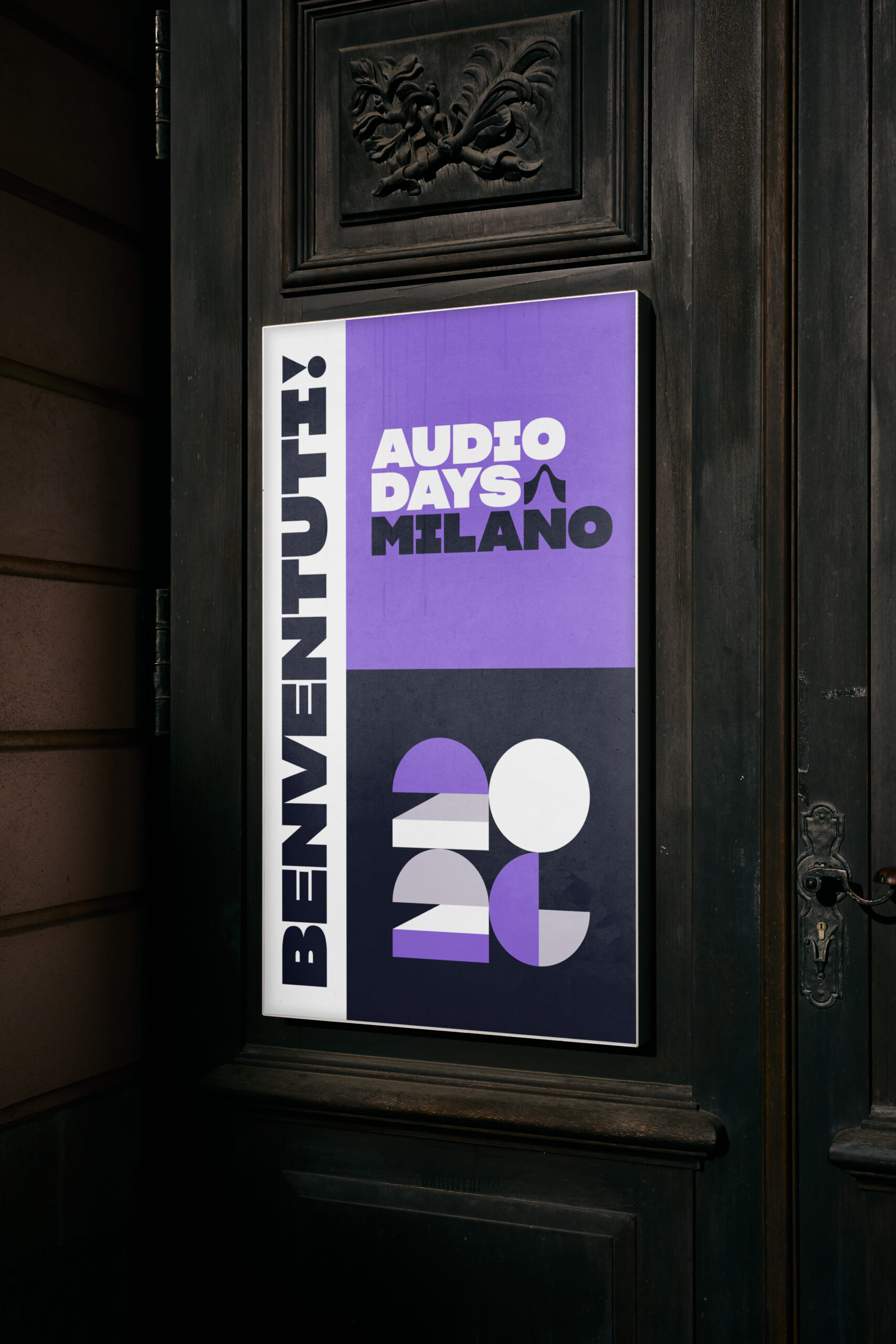
The conference features individual lockups of the host city (below) giving each event it's own logo.
The presentations for the day-long event featured introduction, break, and closing animations with a graphic illustration style to match the boldness of the typography and visual system.
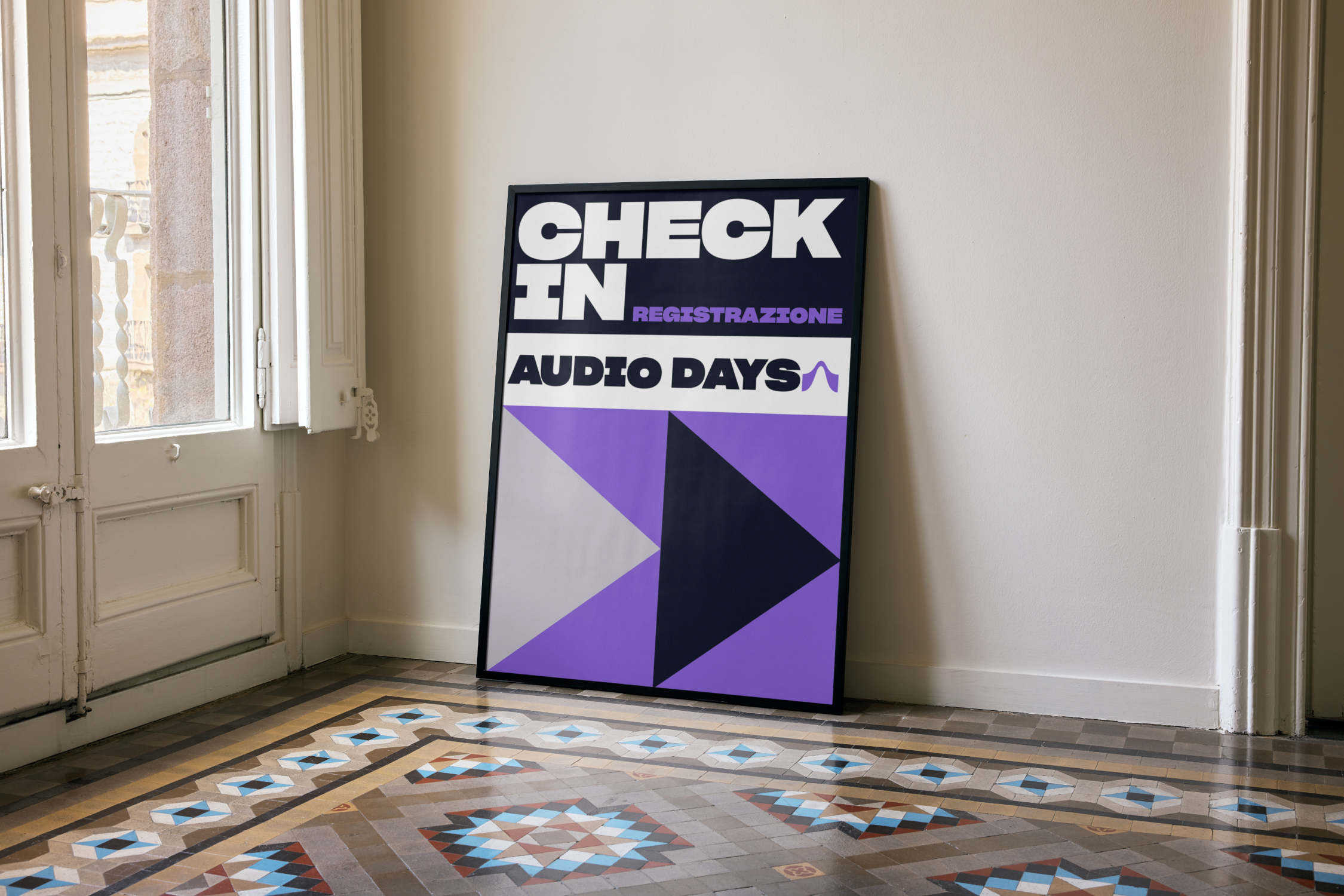
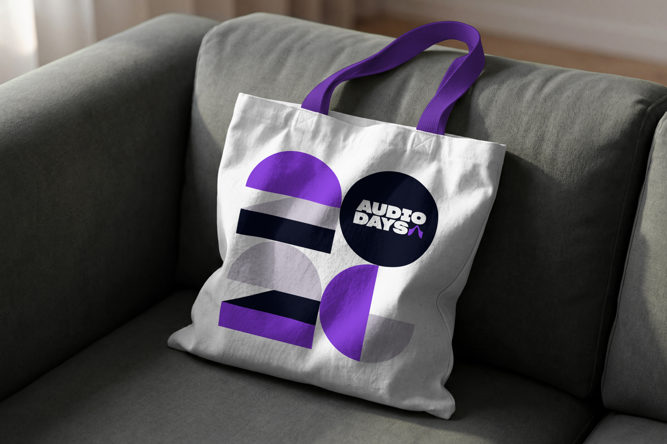
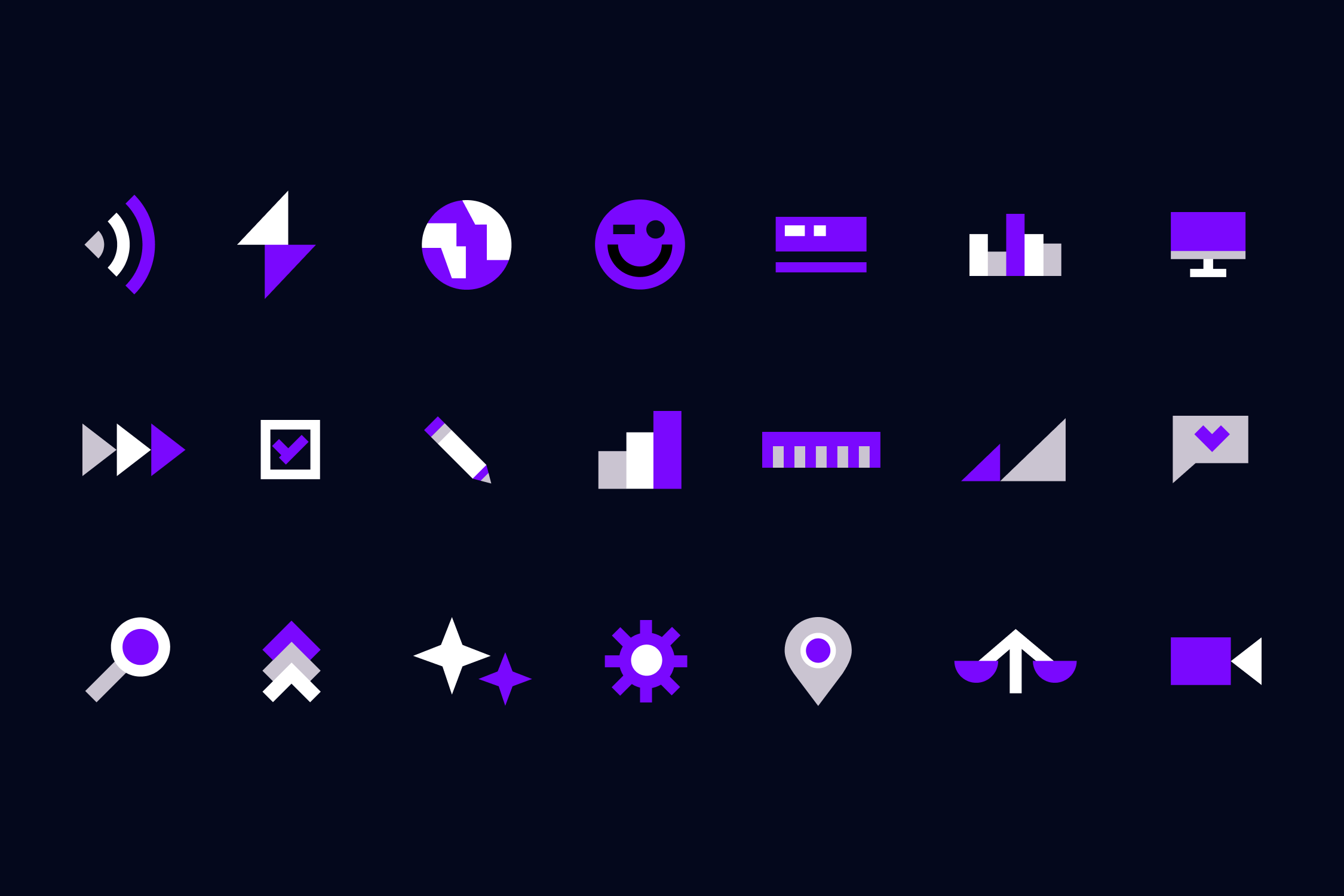
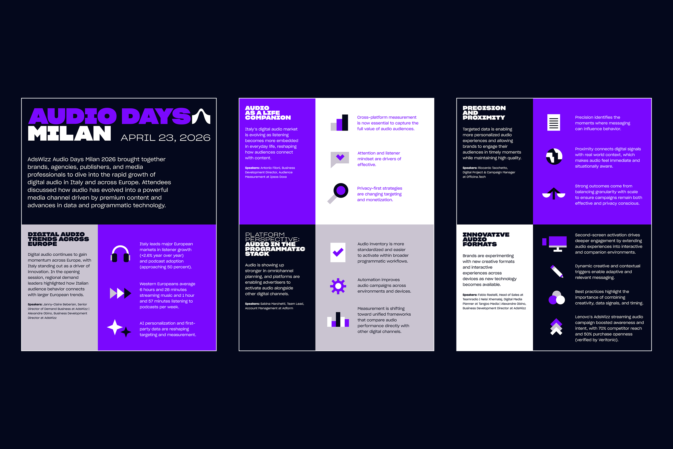
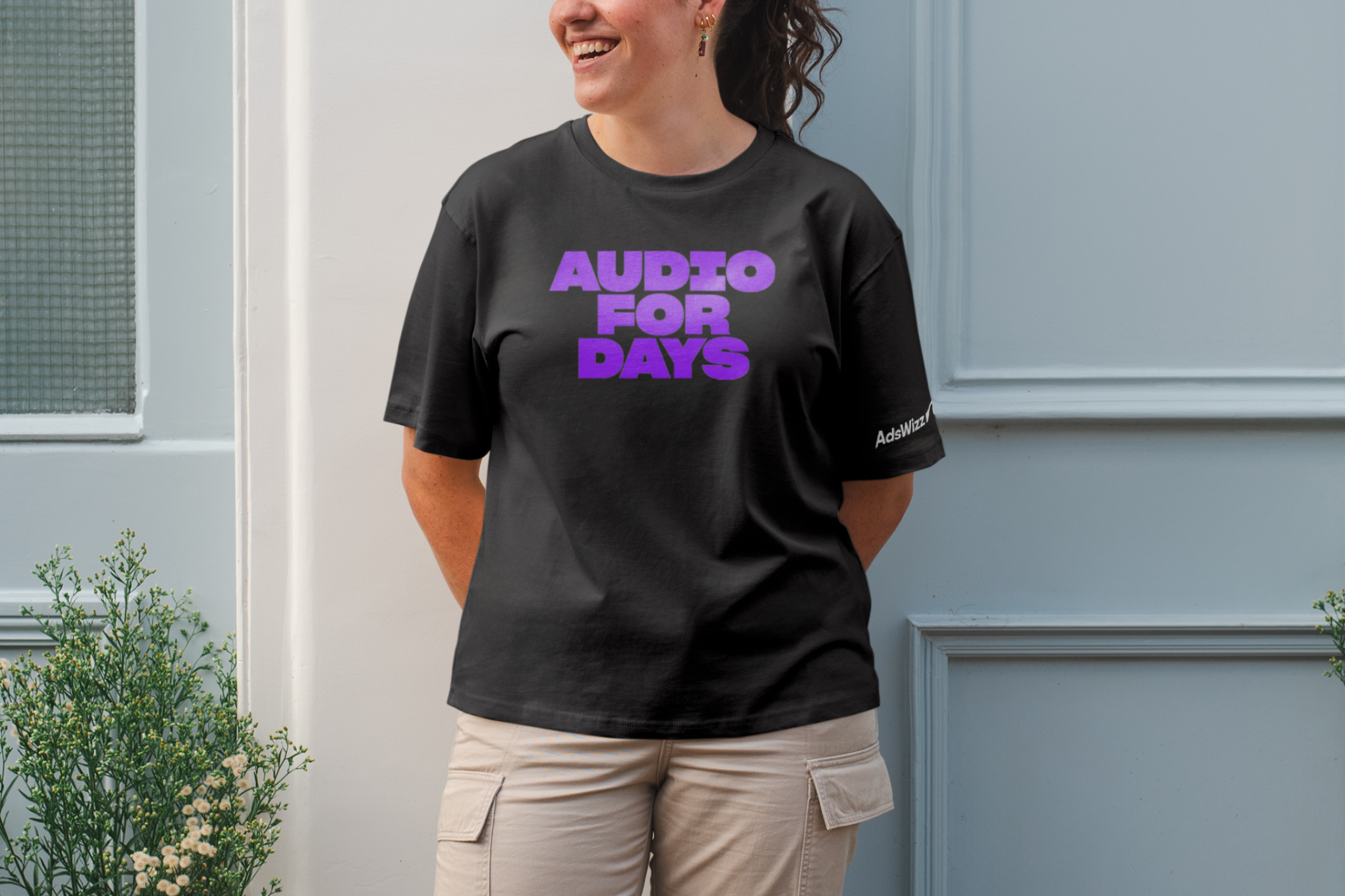
The illustrations carried over to the rest of the presentation slides and into print and marketing materials (below).
bumbalodesign@gmail.com
Sam Bumbalo ©
Sam Bumbalo ©